 Dyslexia is a learning disability. Kids who have dyslexia tend to struggle with reading, spelling, and decoding words. A Dutch graphic artist says he has created a font that can make it easier for dyslexics to read. Could this be the solution?
Dyslexia is a type of learning disability. Some would call it a “disorder”. Symptoms of dyslexia include: difficulty with learning how to read, and problems with interpreting words, letters, and other symbols. Children who are dyslexic usually have problems spelling words correctly, and may “guess” the rest of a sentence in a way that doesn’t end up fitting the context. Dyslexics might mispronounce words that are new to them.
The reasons why a person has this particular learning disability has nothing at all to do with his or her eyesight. It has more to do with the way the brains of the people who have dyslexia process information. There aren’t any medications that can be prescribed that would reduce the symptoms of dyslexia, and this is not a disorder that a person will simply “grow out of”.
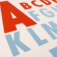
The font you see in the image at the top of this article is not the font that could, potentially, help dyslexics to read. I selected this particular image because it is a good example of a “trick” that can be used by people who have dyslexia to process information. Color coding makes words, or letters, stand out a little bit better. Color coding doesn’t actually change the font that a dyslexic person is trying to read, however.
A Dutch graphic artist named Christian Boer has created a new font that he thinks will help people who have dyslexia to read better. He was diagnosed with dyslexia when he was four years old. He believes that part of the problem that dyslexics have with reading is entirely because of the font that the words are typed in.
Typically, the lower case “b” and the lower case “d” are shown as mirror images of each other in most fonts. This can lead a dyslexic person to have difficulties differentiating between the two letters. The lower case “c”, in some font styles, can be easily confused as the lower case “e”. It is easy to see how this type of confusion can cause problems with reading.
The font created by Christian Boer is called “Dyslexie”. The letters are slightly altered from what they would look like in typical font styles. For example, the rounded part of the lower case “b” has a “pot-bellied” appearance, while the rounded part of the lower case “d” is “top heavy”. As a person who has dyslexia, I am very excited about the possibility that something as easy to change as a font style could make it easier for dyslexic kids, and adults, to read.
Image by Kyle Van Horn on Flickr

